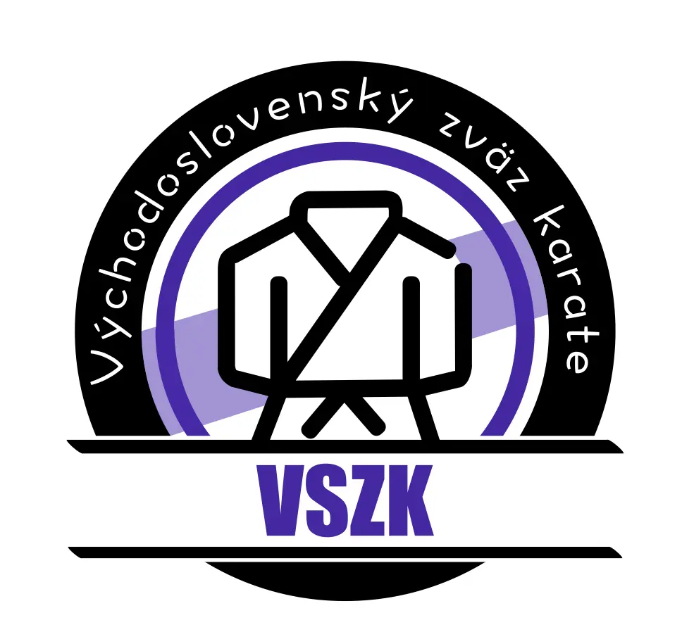
VSZK Logo
The main logo design for the East Slovak Karate Union.
In the world of martial arts organizations, having a strong visual identity is crucial. The logo I designed for VSZK (Východoslovenský zväz karate - East Slovak Karate Union) aims to set them apart in a meaningful way. Opting for a purple color scheme was a deliberate choice, as it provides a unique look among sports unions where red and black are more common. This distinctive approach helps VSZK stand out while maintaining a professional and dynamic appearance that reflects the spirit of karate.
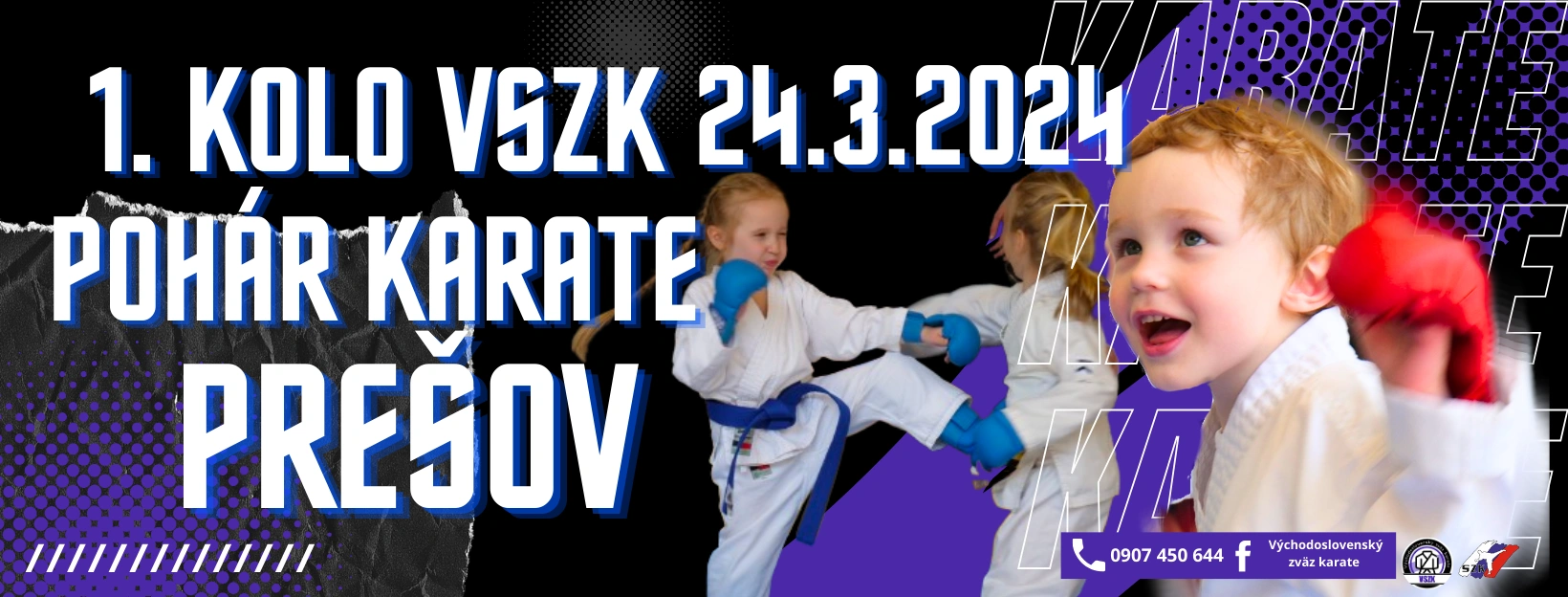
Beyond the logo, my work for VSZK extends to creating various design elements and preparing presentations for karate conferences and events. This comprehensive approach ensures a consistent and impactful brand presence across all their materials, reinforcing their message and values in the karate community.

The main logo design for the East Slovak Karate Union.
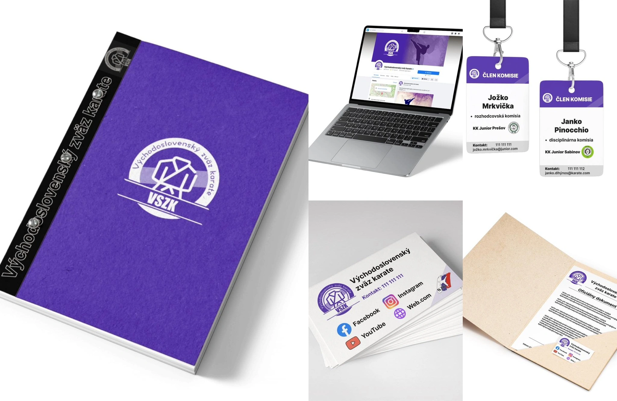
Demonstrating the logo's versatility in real-world applications, such as on Facebook page, is crucial. It showcases how the design maintains its impact and readability across different mediums, reinforcing brand recognition and consistency in various contexts where the VSZK might be represented.
